Very complex & non-standard
I designed B2B Enterprise software & services. On this apps users are experts with extensive knowledge or skills in a specific area or industy.
This software have limited access. Allows exploration and research of these products only in a contolled environment. Require a deep understanding of a specific field to use and regulatory standards. Extensive training was required and takes time but it is worth it.
COMARCH MDM
Followed lean startup approach: MVP and rapid iterations. Crafted UX Competitor Analysis.
Drive UX vision, create UX workflows, run quick prototypes.
Responsible for all UX design decisions to create delightful design such as easy way to contact buyers with suppliers.
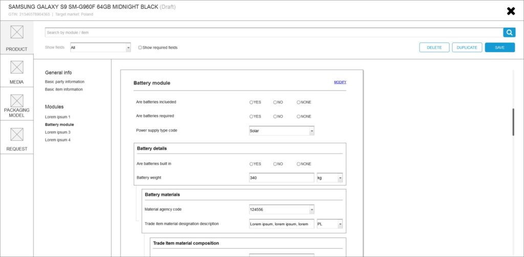
Create sketches, wireframes and mocks to communicate user flows and interactions to engineers and marketing.
Focusing on ensure successful delivery of MDM project by managing the design process.
UX Competition Analysis
The biggest competition for ComarchMDM is 1WorldSync and FSEnet. I decided to design all the main functions of these applications in a much more friendly, easier and simpler way.
Less is more
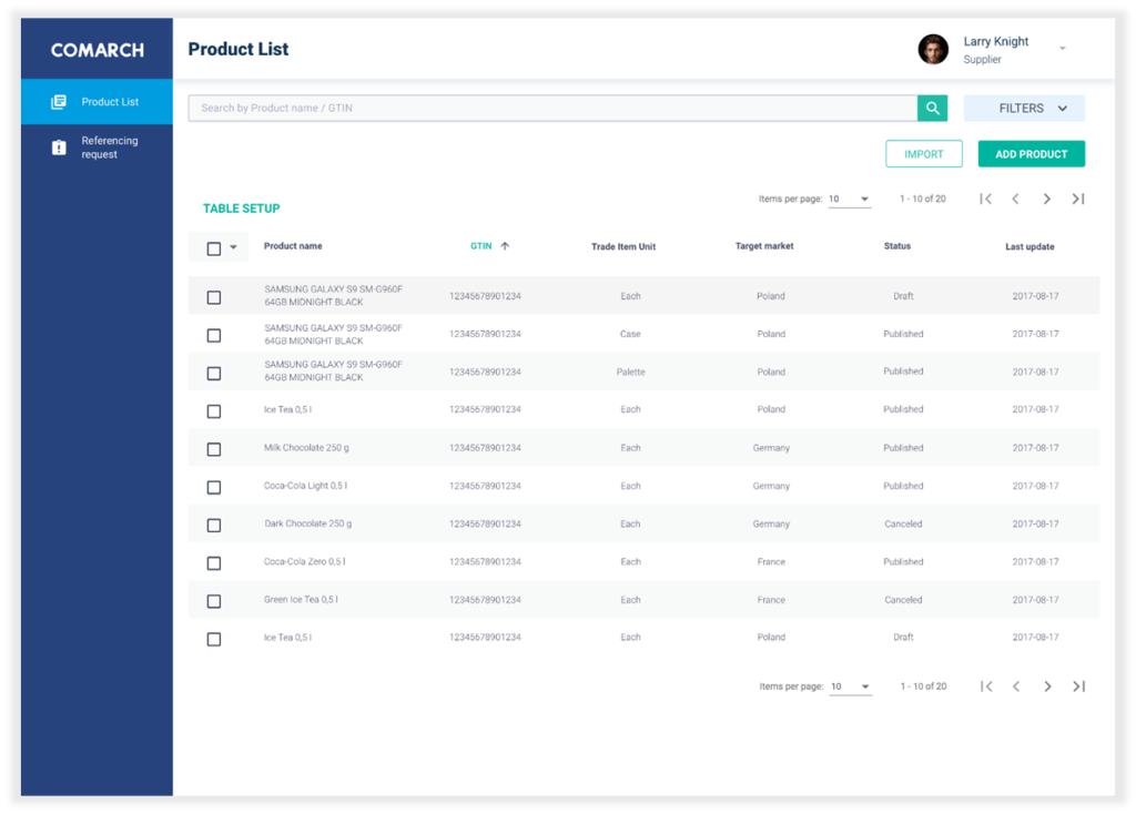
Trying to simplify the complicated views of competing platforms, I decided to follow the principle “less is more” and not show all possible options on the one screen. All functionalities are of course available, however, in order to not show the user options which he doesn’t need, the Comarch MDM shows only those options which are available during current process.
The result is certainly more individual screens during the process, but thanks to this we managed to get a light interface and not disturb the user with uninteresting options.
Product card and edition
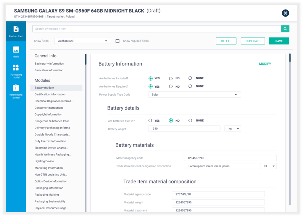
After selected item from the list of products, the list is obscured by a new card (leaving the bottom of the screen) on the full screen with information about the product that has just been selected.
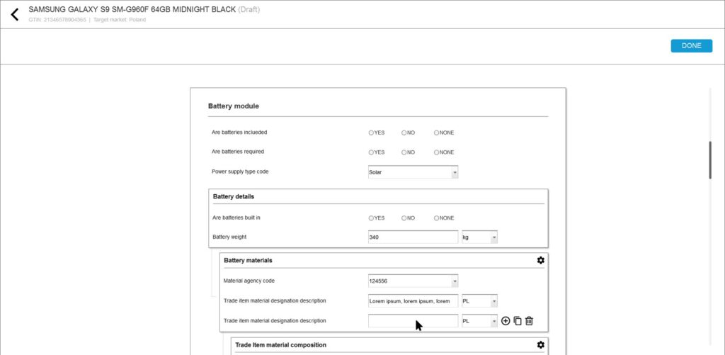
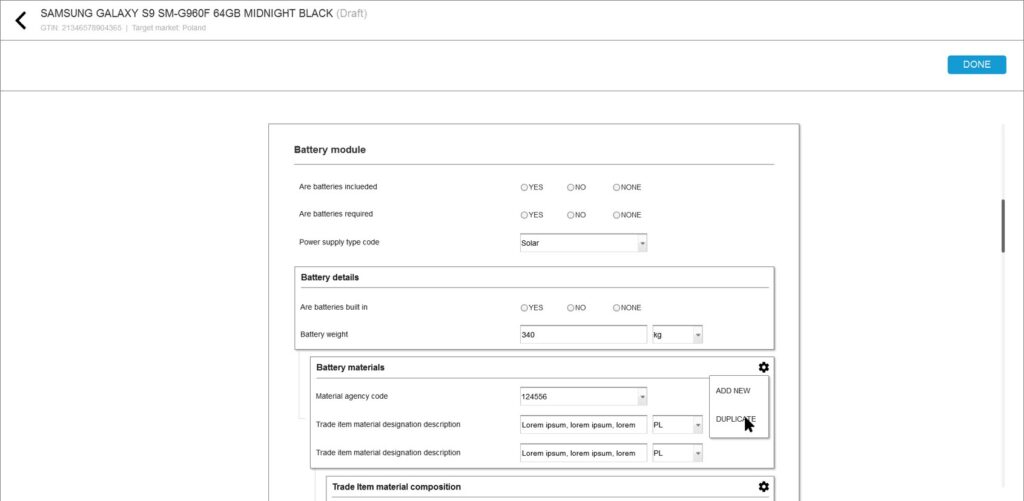
On the product card, we can see the edit inputs that allow the possibility of adding data or changing their value. However, if user want more advanced edition for example copy all module, user have to use ‘Modify’. After that will receive many more editing options (compatible with GDSN) than just
supplementing or editing product data.
After selected ‘Modify’, the product card is covered with another new card for advanced editing (now the specific selected module on which we have chosen ‘Modify’). After saved it, the card disappears and we see again the previously obscured product card with modified ‘data’ on the card.
Packaging model
According to GDSN standards, any product that the seller wants to publish must contain information on how to pack it.
That’s why we created the ‘Packaging model’ – screen to creating and showing way how products which the suppliers offer for sale can be pack.
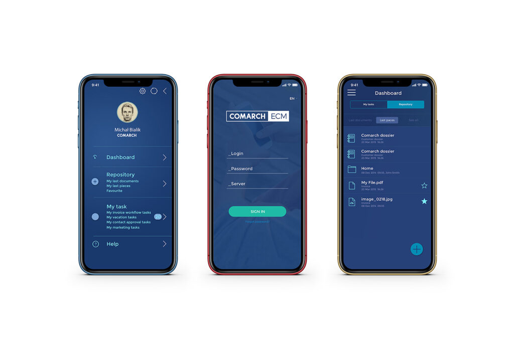
COMARCH ECM
Enterprise Content Management
Role: UX/UI DESIGNER
Time: OCTOBER 2015 – JANUARY 2017
Complex enterprise content and business processes management.
Enterprise Content Management (ECM) systems allow for synergistic approach to processes, data and documents. The systems improve the efficiency of the organization through the built-in tools to capture data, regardless of their origin: files, e-mail, scans of hard copy documents. Additionally, it is possible to efficiently manage documents (organization, control, search) and business processes (design, supervision, reporting).
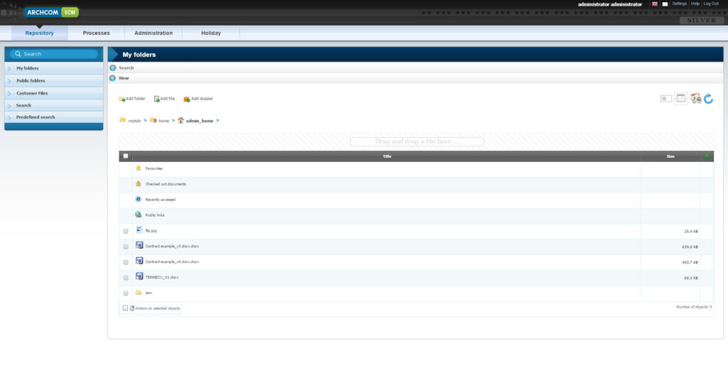
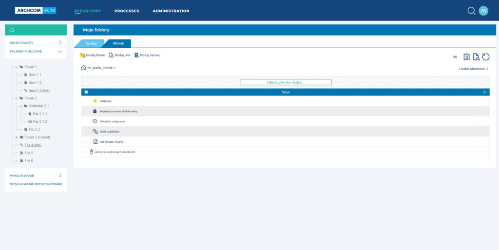
As the only designer, I took the responsibility from strategy to the redesign of Comarch Enterprise Content Management, huge platform to capture, manage, store, preserve, and deliver content and documents related to organizational processes.
Working closely with engineers, product managers and QA to build new quick search tool.
Create new UI
Challenges
- Introduction and integration of an ECM system to back-end and front-end systems
- Adopting change to pension administration schemes for our clients
- Realization of the most comprehensive possible digitization of documents and automation of
business processes
Benefits
- Uniform filing of documents through predefined workflow process and improved searchability of documents thanks to standardized indexing categories
- System internal ticket system for tracking of client and member requests
- Improvement of cross-team and location-independent cooperation and standardization of processes
Project results
As a result of the implementation of Comarch solutions, we we gained benefits from:
● Outsourced, sophisticated management of outgoing and incoming customer correspondence
● Fully paperless and partially automated processes in handling incoming and outgoing customer
correspondence
● Connected ECM to Mercer’s portal solution and other back-end and front-end systems
● Process acceleration
● Audit-proof archive for all customer-related documents
● Optimization and automation of consultancy’s communication processes
● Higher quality of customer services
● Higher data quality
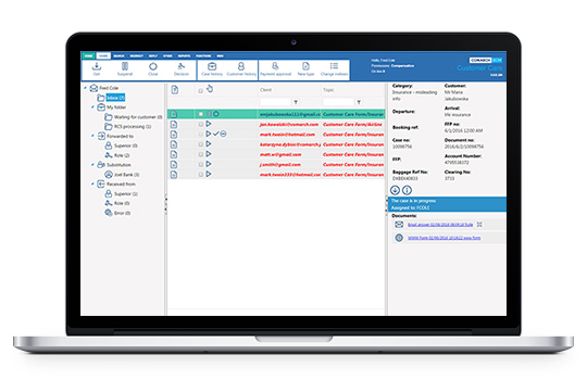
COMARCH CUSTOMER CARE
Role: UX DESIGNER & RESEARCHER
Time: FEBRUARY 2017 – JULY 2017
- Researched and identified problems through users talks and user research in the complex industry of airlines.
- Designed and validated workflows and interfaces through iterations.
- Collaborated with multiple roles to drive alignments.
UX Research
The opportunity to do UX research and usability testing (only 2 days!) of our service with real users in
March on Scandinavian airlines gave me much more answers and new ideas than a month sitting in office and trying design correct solution.
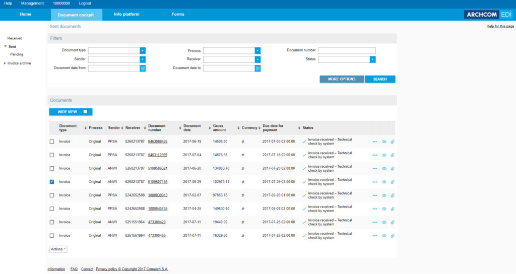
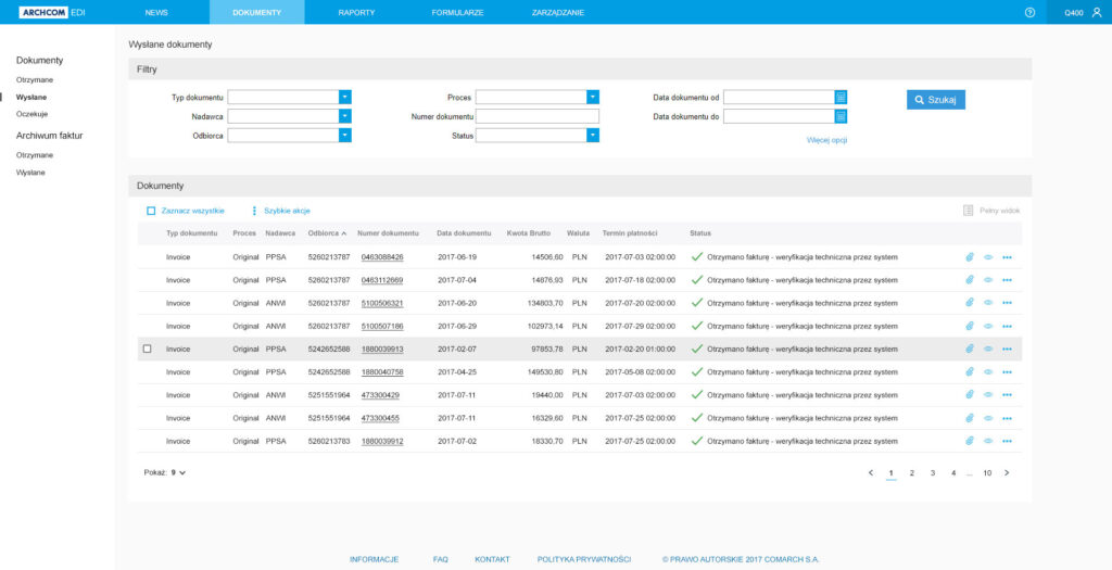
COMARCH EDI BG PORTAL
Role: UX/UI DESIGNER
Time: AUGUST 2017 – OCTOBER 2017
- Redesign main task flows of BGP, a manager invoices platform and delivered comprehensive design specs.
- Supported the Łódź Comarch team in the design of a web app.
- Created guidelines.
- Work closely with engineers, PMs and analysts.
- Responsible for all UX and UI design decisions.

